

The figure-8 shaped things in the corners are ingenious lazy-suzan-like things that pull completely out of their cabinets, and support a surprising weight: they make the corner storage accessible, a necessity when we have three corners.

Above the diagram is the dining room and above that on the left is the front door; below is the hallway to the bedrooms and guest bathroom: there's a clean traffic flow from front door through kitchen to bathroom without interfering with cooks. The right side of the kitchen is the cooking side, the left is the drinks side: guests can get their own vermouth, beer, cocktails, wine and have their own sink.
Last month, mimouca presented us with materials and appliances selections -- actually, three different sets at three price points. Seeing such specifics allowed us visualize the space and helped us to hone our vision for the look-n-feel.
When we first set out to think about materials, the feel of the kitchen, I suggested blonde wood cabinets to provide a natural warmth. Irene immediately retorted, "I'm done with wood." OK, then! In the end, we've picked an overall theme that I keep thinking of as "space ship". In a good sense, I hope: very stark, very clean, very open. I think we need this feeling of openness in a compact kitchen. This kitchen is in the center of the apartment, so not going to get bathed by all the natural light we're used to -- but in the diagram, there are windows looking into light shafts above the drinks sink, and to the right of the cooking sink. The stark white appearance should help amplify that light throughout the kitchen.
When we were living in Barcelona in August, we visited the giant store El Corte Ingles for inspiration and saw a look that really struck us: cabinets with glass doors back-painted with white. They had a visual depth somewhere between frosted glass and the high gloss of typical European lacquer, and it worked beautifully with stainless appliances. While we're not fixated on stainless (a bit trendy and over-hyped) the combination was really appealing. This isn't a great photo, but notice the soft reflections in the glass, especially on the cabinet on the far left; it looks a lot more appealing, and even warm, in person.


This aesthetic -- watery glass with silvery metal -- drives the aesthetic of the kitchen.
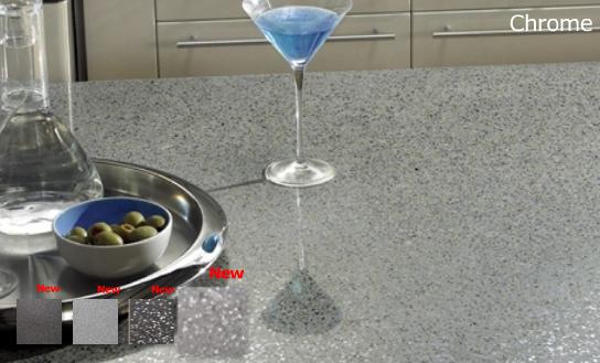
While I like the depth and natural beauty of granite, we felt it was too busy and more organic than we were looking for in this kitchen. We saw at El Cort Ingles a Silestone countertop material in "Steel" pattern that we liked, an almost concrete gray with tiny flecks of metal, a very fine texture. More heat resistant and less porous than granite. Hard and cool, rather industrial. And made in Spain.

While it combined beautifully with stainless, like the sinks, we were concerned that over the large expanse of the counter that it would become a bit uniform, boring. Then we saw their "Chrome" pattern which had a more interesting texture of the metallic flakes in the matrix -- also dynamite with the stainless sinks -- and we were hooked:

Mimouca suggested a sink we really like, very square, the Barco Claron. We'll get the big one for the food side, and a smaller, square one for the drinks side:


A top-mount control is much better for us: we picked the Blanco Alta, below:

The white squares at the bottom of the floor plan diagram are identical mirror-image fridge/freezers, or "combis" as they say in Spain. We had planned to have a full-height fridge on the food side and a combi on the drinks side (for drinks, duh, and also for an frozen bits from our cooking adventures) but couldn't find a line of appliances that had the same appearance for both functions. We decided to get two identical units for visual symmetry, and also utility. We'll hinge the doors so they open into their respective spaces. I think it's gonna looks quite stunning: stainless columns framing the hallway to the back of the apartment. We were really looking for one with no visible hardware (handles, grab bar) and Bosch had a sister model that fit those needs, but this one's more energy efficient and a bit quieter, so Siemens 2-meter combi with its bolshy grab handle it is:


(It's crazy: we recently had to replace our behemoth 48-inch counter-depth fridge and it cost a lot of money; we just figured that's what it cost and had to suck it up. But a pair of these 60cm fridges with a combined identical capacity costs 1/5th what our fridge in the States costs. I don't get it: maybe it's just that Europe has standardized on the 60cm size for everything, so there's more competition. I'm delighted to get so much fridge for, relatively speaking, such a good price.)
We love our current gas Blue Star (domesticated Garland) cooktop, a 6-burner monster that's all about brutish heat: heavy cast iron and star burners. But we can't get gas in Spain. It's been a long time since I cooked on electric, and I am not looking to go back to it. But we've been hearing a lot about chefs and serious cooks who are all going induction since it heats the pan (only) so there's no waste heat and it's a more efficient use of electricity. It also is reacts like gas: you turn off the "burner" and the heat stops -- unlike electric elements. So that decision was easy: induction. In the 60cm width, the most common configuration is a 3-burner layout, but we frequently find ourselves cooking on 4 or more burners at home with our 6-burner cooktop, so I found a slightly up-charge model with 4 elements, and the left side is "flexinduccion" so actually there are 4 zones that can be used in various combinations, e.g., large pan (think cast iron 2-burner griddle), or 2 pans front and back, or maybe even three small pans.

We'll have an oven mounted directly below the cooktop. Mimouca recommended one that's got a feature we've never seen before: it's hinged on the side rather than on the bottom. That sounds really useful to me, since when I'm trying to set in place a big battard of bread dough or a heavy casserole, the bottom-hinge door makes it difficult to maneuver into a hot oven. So we're getting the Siemens convection oven, this one hinged on the left. I expect the door is "light" enough to bump close with a knee, something I can't do with a bottom hinge without a terribly harsh clang/bang closure.


For the floors, we wanted tile, and as much as I respect the traditional Catalan hydraulic tiles with their bold patterns, we needed something impervious to liquids. Mimouca suggested a tan-colored tile with flecks of black, I think because it would transition well to the wood floors in the adjacent dining room. We felt the color was wrong for the white glass, stainless, gray, and black monochromatic theme of the kitchen, so we suggested an alternate by the same brand. Also, the countertop is strikingly patterned so we wanted something more neutral for the floors, that wouldn't conflict. We chose Inalco's Damasco series in Gris: the soft cloudy-pattern shouldn't conflict with the counter and should harmonize with the white-glass cabinets.

It's beginning to feel very real now....