We rebuilt our house on Capitol Hill ourselves, and designed a large kitchen that worked really well for us as active cooks. When we designed our house in Arlington, we started with the kitchen, and it's a treat to be able to take on large projects in it. One of the big attractions of our apartment in Barcelona is the fact that we have the chance to design yet another kitchen, as the floor of the building doesn't exist yet.
We're absolutely delighted we have this opportunity again: it's a real bummer thinking we'd end up living with "someone else's" kitchen. Most are unworkable for real cooking, some focus on looks and magazine styling but have no useful space, or are badly laid out. Or maybe we're just food-obsessed nerds: we know what we like, what works for us and what doesn't. In our past two kitchens, we've made some design choices that worked out really well: keep guests out of the work area, distract them with easy access to refreshments but allow conversation to flow without physical interference; plan for where your tools will live, near where you'll use them; envision two cooks actually preparing a sophisticated meal for 6 people; use durable materials that will hold up to actual use; plan for things magazines never show, like soap dispensers, trash cans and paper towels; have as much storage as you can for tools and supplies; drawer base cabinets are more accessible than door cabinets). We've had to do a little rearranging in our two kitchens, but mostly small stuff like moving flatware closer to the dining room; all the thought-experiments beforehand led to really workable kitchens when built.
We hope to take the lessons we've learned from designing, living with, and cooking in our past kitchens and focus on the essentials, as we settle into a space much more compact than what we've cooked in for the past 20 years.
We've already moved rooms around in the apartment design and moved the kitchen into the original floorplan's bedroom, and our realtors at
Address Properties and our designer with
mimouca barcelona have been great to work with. They recently sent us a couple designs, one of which we felt had all the work areas far too separated, but the other was right along the lines we were thinking. Their CAD drawings showed us that where we'd intended to have a raised bar adjoining the cooking area simply did not have space to accommodate a set of bar stools for guests like we've had in our past two kitchens; disappointing, but important to know. The designers shifted the raised bar and stools to the other side of the kitchen, which we felt was too isolating. Then we realized that with our dining room directly connected to the kitchen (with no walls like in our previous houses) the stools were redundant; OK, they're gone.
We really like the raised bar which lets folks hang out
almost in the kitchen and talk with us while we're cooking, and I tend to use the additional surface as a prep area, for mise-en-place or for serving; it's good for buffet service too. So we moved that back to the main cooking area.
To accommodate guests and keep them out of our work area, we wanted a second area where they can "self-service": grab a beer, pour a glass of wine, make a cocktail. So we have, like our past two kitchens, another area of counter space with a small sink. We're still debating how to accommodate cold drinks -- share the same fridge with the cooking side, or perhaps an under-counter fridge -- but expect the coffee and booze will all live on that side of the kitchen. I'm thinking of it as the drink side of the kitchen (maybe all our glassware should live there too), while the other is the food side: you don't tend to need drink things in your food prep, and vice versa, so their spatial separation is OK.
It's alternately fun and frustrating working on these designs. We're so passionate about our kitchen that we argue incessantly: fridge on right or left of doorway? slide in range or separate cooktop and oven? and OMG, where do the spatulae live? (depends: the ones for prep that should be near the mixing bowls, or are you talking about the heat-proof ones that should live next to the cooktop?). At least we can quickly agree that the knives and cutting boards should both be next to the sink, since that's the hardest working tool in the kitchen and you need the sink for cleaning up and scraps.
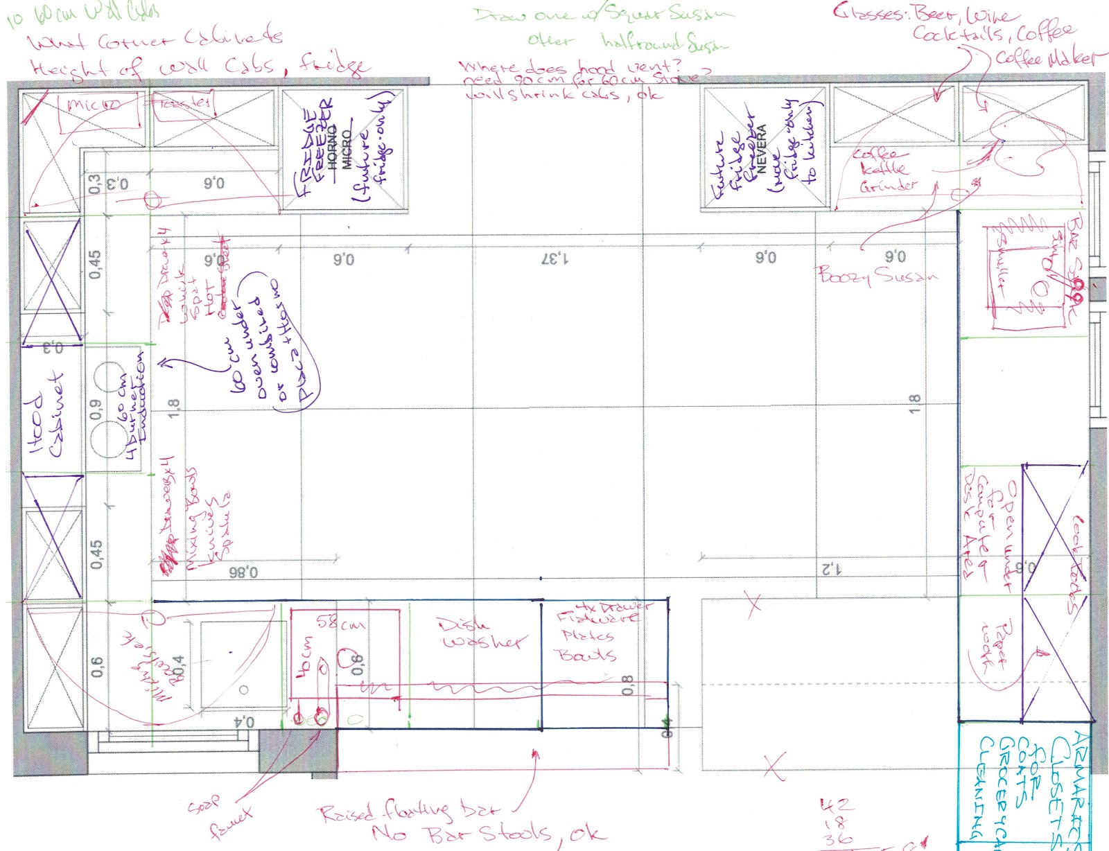
So here's our first set of sketches based on our designers' Option 2. It looks like a ton of changes, but really, it's not: in the drawing below, we move the raised bar from right to the left side (gaining more work area, too), and put a wet bar and computer area on the right area, and fit in as many cabinets as we can.
Now we've got to find out how people in Barcelona access the corners of the cabinets under the counters. We've used big lazy-susans before and they allow easy access to lots of stuff; is the same popular there? If not, we've got to find something else since there are three corners in the kitchen and we definitely want to use that space.
First is the big view showing the dining room on the left, kitchen on the right; the front door is on the bottom left. We realize we'll need a place to put coats, grocery carts and such as we walk in so need cabinets/armoires there. The kitchen is on the right.

Next, we enlarged the kitchen diagram, then marked it up; below we spun it around. On the left is our main work area (the "food side"), on the right is what we're considering the guest side, with a wet bar (the "drink side"). We'd love a big 6-burner behemoth cooktop like we have now, but we simply don't have the space. We started placing large skillets and pots on our current cooktop, and figure we could squeeze a good meal onto 4 burners, if they're spaced well enough apart in the cooktop. We also will have an oven a bit smaller than our current ones, but when we measured the half-sheet pans we always use in our oven -- 18 inches or 46 cm -- we realized they'd fit into a standard European 60 cm oven; OK, that's perfect! (no, we may not take our sheetpans, but it's helpful to know the size of things we use, that sides of salmon or trays of lasagne will fit comfortably; when shopping for appliances and sinks, we take sheetpans and such to ensure they'll fit, before we buy!)
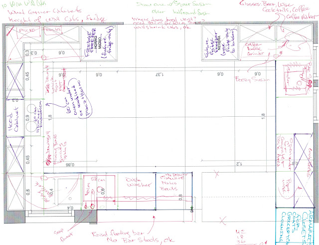
European kitchens seem to be built on a 60 cm grid: ovens, fridges, and standard cabinets are that size. And the fridges are counter-depth (hurray!), the same 60 cm dimension (about 24 inches). The modularity makes it easy to think about how to arrange things. In the drawing above, the main cooking area along the left wall is 5 x 60 cm units, so 3.0 meters (9.8 feet). I've drawn green lines on the 60 cm boundaries to help visualize the modules.
I hope our designers are OK with our changes, and that our builders don't identify any show-stoppers. If that's all OK, then we can start detailing where all our stuff lives, knives, cutting boards, spatulae, mixing bowls, plates, glassware, flatware, napkins, whisks, zesters, cocktail shakers, tongs, and the myriad other things. When that's laid out, we can determine where to get drawer cabinets versus door base cabinets, how lazy-susans and wall cabinets should be hinged. Then we can think about cabinet and countertop materials. And finally appliances. (I think a lot fo folks get this the wrong way around: "I gotta have a Subzero fridge and a Jenn-Air cooker" and too late realize they should have thought about layout and how the cooks work rather than the name badges on the machinery.)
We're looking forward to this adventure....