Saturday, March 19, 2016

Kitchen is Finalized: Floorplan, Materials, Appliances

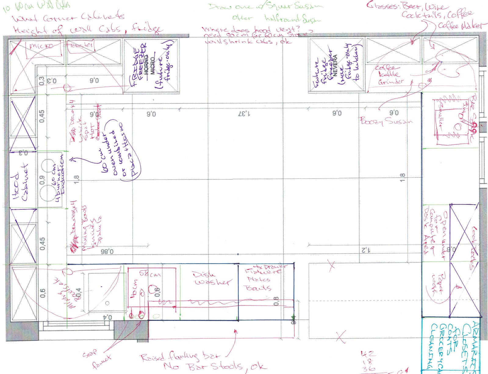
Just before the end of 2015, our designers at mimouca barcelona worked with us to finalize the plans for the house. Naturally, the kitchen floorplan was the most intense: we wrote about their evolution based on mimouca's proposal and our changes in November. Here's the final layout.


The figure-8 shaped things in the corners are ingenious lazy-suzan-like things that pull completely out of their cabinets, and support a surprising weight: they make the corner storage accessible, a necessity when we have three corners.


Above the diagram is the dining room and above that on the left is the front door; below is the hallway to the bedrooms and guest bathroom: there's a clean traffic flow from front door through kitchen to bathroom without interfering with cooks. The right side of the kitchen is the cooking side, the left is the drinks side: guests can get their own vermouth, beer, cocktails, wine and have their own sink.

Last month, mimouca presented us with materials and appliances selections -- actually, three different sets at three price points. Seeing such specifics allowed us visualize the space and helped us to hone our vision for the look-n-feel.

When we first set out to think about materials, the feel of the kitchen, I suggested blonde wood cabinets to provide a natural warmth. Irene immediately retorted, "I'm done with wood."  OK, then!  In the end, we've picked an overall theme that I keep thinking of as "space ship". In a good sense, I hope: very stark, very clean, very open. I think we need this feeling of openness in a compact kitchen. This kitchen is in the center of the apartment, so not going to get bathed by all the natural light we're used to -- but in the diagram, there are windows looking into light shafts above the drinks sink, and to the right of the cooking sink. The stark white appearance should help amplify that light throughout the kitchen.

When we were living in Barcelona in August, we visited the giant store El Corte Ingles for inspiration and saw a look that really struck us: cabinets with glass doors back-painted with white. They had a visual depth somewhere between frosted glass and the high gloss of typical European lacquer, and it worked beautifully with stainless appliances. While we're not fixated on stainless (a bit trendy and over-hyped) the combination was really appealing. This isn't a great photo, but notice the soft reflections in the glass, especially on the cabinet on the far left; it looks a lot more appealing, and even warm, in person.


We don't know what cabinet mimouca will source but we believe they know our tastes in this regard; they provided us this sample:


This aesthetic -- watery glass with silvery metal -- drives the aesthetic of the kitchen.

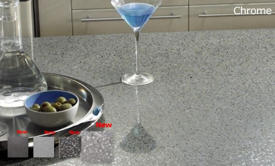
While I like the depth and natural beauty of granite, we felt it was too busy and more organic than we were looking for in this kitchen.  We saw at El Cort Ingles a Silestone countertop material in "Steel" pattern that we liked, an almost concrete gray with tiny flecks of metal, a very fine texture. More heat resistant and less porous than granite. Hard and cool, rather industrial.  And made in Spain.


While it combined beautifully with stainless, like the sinks, we were concerned that over the large expanse of the counter that it would become a bit uniform, boring. Then we saw their "Chrome" pattern which had a more interesting texture of the metallic flakes in the matrix -- also dynamite with the stainless sinks -- and we were hooked:


Mimouca suggested a sink we really like, very square, the Barco Claron. We'll get the big one for the food side, and a smaller, square one for the drinks side: 


The faucet in the picture above with the lemons is attractive too, very simple, and again a bit industrial. Mimouca suggested one with a right-side control (below) -- which seems to be the preferred style in Europe. We recently had the chance to use a similar one at a friend's but I found it unintuitive, and impossible to use with my left hand. When I've got a hot pot in my right hand, I want to be able to quickly get the water going with my left.


A top-mount control is much better for us: we picked the Blanco Alta, below:


The white squares at the bottom of the floor plan diagram are identical mirror-image fridge/freezers, or "combis" as they say in Spain. We had planned to have a full-height fridge on the food side and a combi on the drinks side (for drinks, duh, and also for an frozen bits from our cooking adventures) but couldn't find a line of appliances that had the same appearance for both functions. We decided to get two identical units for visual symmetry, and also utility. We'll hinge the doors so they open into their respective spaces. I think it's gonna looks quite stunning: stainless columns framing the hallway to the back of the apartment. We were really looking for one with no visible hardware (handles, grab bar) and Bosch had a sister model that fit those needs, but this one's more energy efficient and a bit quieter, so Siemens 2-meter combi with its bolshy grab handle it is:


(It's crazy: we recently had to replace our behemoth 48-inch counter-depth fridge and it cost a lot of money; we just figured that's what it cost and had to suck it up. But a pair of these 60cm fridges with a combined identical capacity costs 1/5th what our fridge in the States costs. I don't get it: maybe it's just that Europe has standardized on the 60cm size for everything, so there's more competition. I'm delighted to get so much fridge for, relatively speaking, such a good price.)

We love our current gas Blue Star (domesticated Garland) cooktop, a 6-burner monster that's all about brutish heat: heavy cast iron and star burners. But we can't get gas in Spain.  It's been a long time since I cooked on electric, and I am not looking to go back to it. But we've been hearing a lot about chefs and serious cooks who are all going induction since it heats the pan (only) so there's no waste heat and it's a more efficient use of electricity.  It also is reacts like gas: you turn off the "burner" and the heat stops -- unlike electric elements. So that decision was easy: induction. In the 60cm width, the most common configuration is a 3-burner layout, but we frequently find ourselves cooking on 4 or more burners at home with our 6-burner cooktop, so I found a slightly up-charge model with 4 elements, and the left side is "flexinduccion" so actually there are 4 zones that can be used in various combinations, e.g., large pan (think cast iron 2-burner griddle), or 2 pans front and back, or maybe even three small pans. 


We'll have an oven mounted directly below the cooktop. Mimouca recommended one that's got a feature we've never seen before: it's hinged on the side rather than on the bottom. That sounds really useful to me, since when I'm trying to set in place a big battard of bread dough or a heavy casserole, the bottom-hinge door makes it difficult to maneuver into a hot oven. So we're getting the Siemens convection oven, this one hinged on the left. I expect the door is "light" enough to bump close with a knee, something I can't do with a bottom hinge without a terribly harsh clang/bang closure.


Mimouca seems to understand our aesthetics and picked an interesting exhaust hood. This one has a pull-out frosted glass flap to help capture the smoke and steam. Most importantly, it exhausts out of the apartment, through the roof. It's Frecan's Vetro Klin, made in Spain, very minimalistic.


For the floors, we wanted tile, and as much as I respect the traditional Catalan hydraulic tiles with their bold patterns, we needed something impervious to liquids. Mimouca suggested a tan-colored tile with flecks of black, I think because it would transition well to the wood floors in the adjacent dining room. We felt the color was wrong for the white glass, stainless, gray, and black monochromatic theme of the kitchen, so we suggested an alternate by the same brand. Also, the countertop is  strikingly patterned so we wanted something more neutral for the floors, that wouldn't conflict. We chose Inalco's Damasco series in Gris: the soft cloudy-pattern shouldn't conflict with the counter and should harmonize with the white-glass cabinets.


That's about it for the exciting visible stuff. We're spec'd under-cabinets lights, plenty of 'em, using LEDs to avoid the heat of halogens, but with a 3000K color spectrum that's food-friendly.

It's beginning to feel very real now....

Thursday, November 19, 2015

Designing our Barcelona Kitchen

We rebuilt our house on Capitol Hill ourselves, and designed a large kitchen that worked really well for us as active cooks. When we designed our house in Arlington, we started with the kitchen, and it's a treat to be able to take on large projects in it. One of the big attractions of our apartment in Barcelona is the fact that we have the chance to design yet another kitchen, as the floor of the building doesn't exist yet.

We're absolutely delighted we have this opportunity again: it's a real bummer thinking we'd end up living with "someone else's" kitchen. Most are unworkable for real cooking, some focus on looks and magazine styling but have no useful space, or are badly laid out.  Or maybe we're just food-obsessed nerds: we know what we like, what works for us and what doesn't. In our past two kitchens, we've made some design choices that worked out really well: keep guests out of the work area, distract them with easy access to refreshments but allow conversation to flow without physical interference; plan for where your tools will live, near where you'll use them; envision two cooks actually preparing a sophisticated meal for 6 people; use durable materials that will hold up to actual use; plan for things magazines never show, like soap dispensers, trash cans and paper towels; have as much storage as you can for tools and supplies; drawer base cabinets are more accessible than door cabinets).  We've had to do a little rearranging in our two kitchens, but mostly small stuff like moving flatware closer to the dining room; all the thought-experiments beforehand led to really workable kitchens when built.

We hope to take the lessons we've learned from designing, living with, and cooking in our past kitchens and focus on the essentials, as we settle into a space much more compact than what we've cooked in for the past 20 years.


We've already moved rooms around in the apartment design and moved the kitchen into the original floorplan's bedroom, and our realtors at Address Properties and our designer with mimouca barcelona have been great to work with. They recently sent us a couple designs, one of which we felt had all the work areas far too separated, but the other was right along the lines we were thinking.  Their CAD drawings showed us that where we'd intended to have a raised bar adjoining the cooking area simply did not have space to accommodate a set of bar stools for guests like we've had in our past two kitchens; disappointing, but important to know. The designers shifted the raised bar and stools to the other side of the kitchen, which we felt was too isolating. Then we realized that with our dining room directly connected to the kitchen (with no walls like in our previous houses) the stools were redundant; OK, they're gone.

We really like the raised bar which lets folks hang out almost in the kitchen and talk with us while we're cooking, and I tend to use the additional surface as a prep area, for mise-en-place or for serving; it's good for buffet service too. So we moved that back to the main cooking area.

To accommodate guests and keep them out of our work area, we wanted a second area where they can "self-service": grab a beer, pour a glass of wine, make a cocktail. So we have, like our past two kitchens, another area of counter space with a small sink. We're still debating how to accommodate cold drinks -- share the same fridge with the cooking side, or perhaps an under-counter fridge -- but expect the coffee and booze will all live on that side of the kitchen. I'm thinking of it as the drink side of the kitchen (maybe all our glassware should live there too), while the other is the food side: you don't tend to need drink things in your food prep, and vice versa, so their spatial separation is OK.

It's alternately fun and frustrating working on these designs. We're so passionate about our kitchen that we argue incessantly: fridge on right or left of doorway? slide in range or separate cooktop and oven? and OMG, where do the spatulae live? (depends: the ones for prep that should be near the mixing bowls, or are you talking about the heat-proof ones that should live next to the cooktop?). At least we can quickly agree that the knives and cutting boards should both be next to the sink, since that's the hardest working tool in the kitchen and you need the sink for cleaning up and scraps.


So here's our first set of sketches based on our designers' Option 2.  It looks like a ton of changes, but really, it's not: in the drawing below, we move the raised bar from right to the left side (gaining more work area, too), and put a wet bar and computer area on the right area, and fit in as many cabinets as we can.

Now we've got to find out how people in Barcelona access the corners of the cabinets under the counters. We've used big lazy-susans before and they allow easy access to lots of stuff; is the same popular there? If not, we've got to find something else since there are three corners in the kitchen and we definitely want to use that space.

First is the big view showing the dining room on the left, kitchen on the right; the front door is on the bottom left. We realize we'll need a place to put coats, grocery carts and such as we walk in so need cabinets/armoires there. The kitchen is on the right.


Next, we enlarged the kitchen diagram, then marked it up; below we spun it around. On the left is our main work area (the "food side"), on the right is what we're considering the guest side, with a wet bar (the "drink side"). We'd love a big 6-burner behemoth cooktop like we have now, but we simply don't have the space. We started placing large skillets and pots on our current cooktop, and figure we could squeeze a good meal onto 4 burners, if they're spaced well enough apart in the cooktop.  We also will have an oven a bit smaller than our current ones, but when we measured the half-sheet pans we always use in our oven -- 18 inches or 46 cm -- we realized they'd fit into a standard European 60 cm oven; OK, that's perfect! (no, we may not take our sheetpans, but it's helpful to know the size of things we use, that sides of salmon or trays of lasagne will fit comfortably; when shopping for appliances and sinks, we take sheetpans and such to ensure they'll fit, before we buy!)


European kitchens seem to be built on a 60 cm grid: ovens, fridges, and standard cabinets are that size. And the fridges are counter-depth (hurray!), the same 60 cm dimension (about 24 inches). The modularity makes it easy to think about how to arrange things. In the drawing above, the main cooking area along the left wall is 5 x 60 cm units, so 3.0 meters (9.8 feet). I've drawn green lines on the 60 cm boundaries to help visualize the modules.

I hope our designers are OK with our changes, and that our builders don't identify any show-stoppers. If that's all OK, then we can start detailing where all our stuff lives, knives, cutting boards, spatulae, mixing bowls, plates, glassware, flatware, napkins, whisks, zesters, cocktail shakers, tongs, and the myriad other things. When that's laid out, we can determine where to get drawer cabinets versus door base cabinets, how lazy-susans and wall cabinets should be hinged. Then we can think about cabinet and countertop materials. And finally appliances. (I think a lot fo folks get this the wrong way around: "I gotta have a Subzero fridge and a Jenn-Air cooker" and too late realize they should have thought about layout and how the cooks work rather than the name badges on the machinery.)

We're looking forward to this adventure....

Sunday, October 11, 2015

¡Vamos a España!

Well, we signed the contract on the flat in Barcelona yesterday. We weren't able to send the reserve payment due to security restrictions with the web and mobile app: I didn't have my one-time password card for our Spanish bank account here in Peru, so that'll wait until we return home tomorrow.

Our folks at Address.Properties and the project's architect have been vary patient and helpful as we've been ironing out the details. The floor isn't built yet, so we've changed the layout of the flat, and will be heavily customizing the kitchen (big surprise there!).

Which reminds me, I owe them some diagrams showing where we want the radiators so they don't interfere with our planned furniture layout. Something like this:


The windows on the left side look out directly over the marvelous Mercat de Sant Antoni and over the city to Montjuïc.  The ones on the right open to a meter-deep balcony looking into the interior of the block.  The stairway in the center will go to the private roof deck, and stairs and new elevator go down to the lobby. We expect the flat to be finished late Summer 2016.

Sadly, we're still working-class stiffs so can't just pick up and move to Spain. We expect we'll have to rent it out for a few years before we move permanently.  We hoping to rent it out for about a year at a time and spend a month there each year until that time. Barcelona's stopped issuing permits for short-term "tourist" rentals, in an effort to prevent tourists overrunning the city, so the minimum rental period we could offer would be a month. We'd prefer long-term renters to hen-nights and party-hardy folks anyway.

Friday, October 9, 2015

OMG, A Roof Terrace!

Last time we wrote about an unbuilt apartment we were seriously interested in -- until we found out we couldn't have a walk-out terrace.

We were about ready to storm out of the meeting when the project's architect said something about a roof terrace. He was speaking Spanish, but I could swear he said it was a "terrassa privada" -- a private terrace.  What??!!  Our agent didn't even know about this!

He pulled out his architecture drawings and showed us the roof plan. The entire thing was going to be a roof terrace.  And it was going to be split in half, for use by the two top-floor (atico) owners. For private use by them. None of the owners of the apartments on the other floors would have access.

OK, not the entire roof. There would be a central core where the elevator and stairs and light well comes up, naturally. And around this would be an area reserved for technical equipment -- the air conditioner compressors for the apartments, etc. Here's our portion:


OMG, it's big. The diagram shows 87.9 square meters, almost 950 square feet. That's about as big as one of the floors in our existing house.

We started laying it out with our design software. Some planters around the technical equipment, plenty of outdoor dining space, a hot tub (!), more chairs, a video projector, a barbecue (which I gather is not legal in Barcelona but we saw stores selling Weber kettles and charcoal).  There's plenty of room. Below, the left side looks out to Mercat de Sant Antoni and then on to Montjuïc; the right looks into the interior of the block which is filled with courtyards and decks; top and bottom edges are neighboring buildings.


We have to walk up the central staircase to get to the roof terrace, and that's something we were hoping to avoid because we're not getting any younger. I mean, we've got another 10 or 20 years probably before this would become a problem.  But I did ask the builders if they could talk to the other penthouse owner to see if they'd be willing to split the cost of extending the elevator up to the roof -- not cheap, but a lot easier for schlepping up provisions for a big dinner party.

Our agents said if that wasn't possible, we could build our own private elevator from our flat to the roof, once the construction was done.  I think this is probably not so uncommon, since so many old buildings there have been retrofitted with elevators in small spaces.

From the current roof, we've got a decent view over the market, Montjuïc and the city.  We're hoping that with when our new floor  is added we might be high enough to get a glimpse of the Mediterranean as the building faces the direction of the port. We're not optimistic, but it'd be pretty cool.

Thursday, September 3, 2015

It's starting to get serious at Sant Antoni

The folks at Address.Properties have been working hard with us to try and nail down details before we left Spain. Unfortunately, so many people in Barcelona were on vacation that we couldn't finalize things.  And we have a lot of details to nail down.

What the hell am I talking about?

Irene found a place across the street (really, right across the street) from Mercat de Sant Antoni. The building is undergoing a complete renovation, with new wiring, plumbing, and structural reinforcement just for us... OK, to support the addition of a new top story. That's the one we want, "el atico", the penthouse.  There are two in this renovation and one's sold. We've got our eye on the other.  The quality of the work we can see looks quite good.


One of the lower flat's done, and another we saw is well on the way. Where they can, they've salvaged the antique Catalan tiles. Irene's not a fan and the patterns are a bit too busy but I like how they've combined the antique with clean modern lines of the fixtures.
 Salvaged French doors overlooking the Mercat.

 Wood floors into the back bedroom with its own French doors to a balcony.

Because construction on el atico (I love saying that) hasn't started, we could have some freedom to influence the design.  Oh, look: our new kitchen!
Irene surveys the interior courtyard from the current roof, which will be built up a bit, then el atico built on top.


OMG.  We renovated our 100-year old house on Capitol Hill with our bare hands, moving a staircase and bathroom to make room for a kitchen we really loved, redoing all the plumbing so we had good water pressure, and rewiring the house to serve modern needs.   We then designed our concrete and steel house in Arlington, with open spaces and tons of light everywhere.  We've got a bug: I don't think we'd be happy in someone else's house.  This presented an opportunity we'd sadly resigned ourselves to never experiencing again.  Irene instantly filled the flat on Raval we were staying in with dozens and dozens of variations on floor plans. I found the Roomle web-based floor-plan software which could give us a good 3D visualization and help identify too-tight areas. We drew up a plan that sacrificed some of the proposed living room for a walk-out terrace; I thought it would be interesting to introduce a diagonal element to the shape.


We met with Alfonso, the architect for the whole building project. Then we asked: since this is new construction, can we push in the facade to create a terrace? No. Not a chance. The architecture board would never approve it. No way, no how.

He's got some great ideas about how to incorporate the vertical extension of the building with the historical facade, and hopes he can persuade the board to approve his more adventurous plans.  We love his work. I don't want to violate his intellectual property so below is just an excerpt of one of his drawings; too bad I took the photo crooked with my camera.


But we were crushed: the walk-out terrace was non-negotiable for us. We expect we'll eventually get old and don't want to have to walk downstairs to a park, or whatever; we're used to our outdoor space in DC and Arlington and take our breakfast and dinners outside whenever we can. We felt like outdoor cats that have been told they have to stay inside.

We were about to walk out when he told us something that our realtor wasn't even aware of, that got us to sit up and listen intently, that rekindled the enthusiasm.

To be continued...

Invisible apartment with a great location

Irene found a listing through Address.Properties. We're really keen on it.

You know what the realtors say: location, location, location. Well, this place has it -- at least for our tastes. It's right next to our favorite market, Mercat de Sant Antoni, that we've written about before. The renovation work is really coming along quickly, now.


We're not getting any younger, so it's nice to know we can hobble over to the market and get our bacalao, shellfish, fin fish, fowl, rabbit, snails, fruits, vegetables, nuts, olives, and even a good bite to eat and some vermouth or cava to slake our thirst from the arduous trek across the street.


It's 3 blocks to the Airport bus, which we used several times this trip. It's a 3 minute walk to the L2 (purple) metro, and 8 minutes to the L1 (red) or L3 (green) lines. We explicitly don't want a car, so this is great for us.

There's an antiquarian book fair that's set up every Sunday on the cross street, and the stalls spill over onto the adjoining streets, including one in front of "our" front door. I bought some comic books aimed at kids in Castilian to help me learn the language; no way I'm ready for the Catalan books I almost picked up.


After I saw Irene off at the Airport bus, I wandered around and it seemed like there are at least 20 cafes open, even on a Sunday morning when many things are closed, with a 2 block radius of "our" place. The spiffy Moritz brew pub is a block or two away.

We determined empirically that neighborhood fixture Els Tres Tombs' cafe stays open an hour later than the other cafes. Great for night owls like us, and 3 minutes from "our" place. We spent at least a couple happy afternoons at this place when we were here years ago.

There's just one small problem: our place doesn't exist yet. More later...

Wednesday, September 2, 2015

Architecture old and new

My last day in Barcelona, after Irene left for Scotland, I had plans for dinner at a fish place, MariscCo. It was a 35 minute walk but I hadn't gotten out of the house much to exercise so I hoofed it. It covered a lot of the same route we've come to repeat heading toward the Plaça de Catalunya. Then it turned straight up and the walk became a noticeable climb. I could see Tibidabo on the top of the mountain (?) in the distance; I walked block after block but its illuminated form never got any closer.

Barcelona's filled with great architecture, both old (gothic) and new (very contemporary).

On Carrer de Balmes, I was entranced by the pure machine-like form of this geometric building; it looks like some science fiction movie computer or an interstellar hibernation chamber. This photo is not black-and-white nor retouched.


The modernistas left their stylistic stamp all over town, with organic and floral shapes like those of the Art Nouveau or Vienna Secession movements; I'm crazy about this aesthetic. Frequently, the plasterwork is not just painted, but incised then painted; it's great work. You can see it here in this dramatically-lit facade on a building a block away from the machine-like building above:


After a fine dinner lubricated with a bottle of good cava, I wasn't in the mood (or shape) to walk home so I headed for the Metro.  One of the sidewalks had this wonderful interlocking tile pattern. I'd first seen it mentioned in a guide book, indicating it was not in fact a modernista design, then later saw it on the swanky Passeig de Gràcia. You can see spiral sea-shell like patterns, but also a second interlocking pattern of flowers that look like thistles and a third that looks like tendrils. I'm curious where this clever and gorgeous design originated. [time passes] I finally got my Google-fu on and found other references to this tile, all pointing out that it's a Gaudi design; makes a ton of sense.